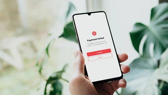


Picture a release that passes every functional test you have. The login works, the API returns the right data, and the automated suite comes back green from top to bottom. Then the screenshots from a few real devices arrive, and the picture is different: a heading overlaps the hero image on one phone, the "Add to cart" button sits halfway off the screen on another, and in dark mode, the confirmation text is nearly invisible against the background. None of it registered as a failure in the test suite, yet all of it ended up as a failure to the people using the product.
That appearance layer is the first impression a user takes in. For example, a screen that renders broken on first load, before any of the working logic underneath has a chance to matter, chips away at confidence in the product from the get-go.
Visual testing exists to close that gap. Functional checks confirm that a screen behaves the way it should, and visual testing confirms that it also looks the way it should while doing so. In this article we will walk through what visual testing covers, how it runs step by step, the tools that automate it, and the places where it still depends on human judgment.
TL;DR
30-second summary
What is visual testing in UI, and what does it catch that functional tests miss?
Visual testing is the practice of comparing screenshots of a rendered screen against an approved baseline, so teams catch layout, color, typography, and alignment defects that functional tests don’t check.
- Visual testing covers the appearance layer functional tests skip. A button can be the wrong size, color, and position and still pass every test that only asked whether clicking it worked. Visual testing checks layout and spacing, color and theming, typography, and alignment against the last approved render.
- The process is a four-step loop. Establish a baseline in a known-good state, capture the same screens on the next build, compare each capture against its baseline, then have a person review each flagged difference as an intended change or a regression. Approving a change is a deliberate step, which keeps a redesign from silently overwriting the reference.
- False positives are the main challenge. Pixel-by-pixel comparison flags anti-aliasing, font rendering, animations, and dynamic content like timestamps. Threshold tolerances, masking, disabled animations, and structure-aware comparison reduce the noise, but none of them remove the need for human review.
- It pays off most across combinations. Cross-browser and real-device rendering, responsive breakpoints, dark and high-contrast themes, and translated strings that expand past their containers are where visual regressions pile up. Tools range from open-source options like Playwright, BackstopJS, and Argos to cloud platforms like Percy, Applitools Eyes, and Chromatic.
- Visual testing can’t judge usability or accessibility. A diff can’t tell whether contrast clears a threshold, a touch target is large enough, or a flow makes sense. Deque found its own axe tooling surfaces issues for only 16 of the 50 WCAG 2.1 Level AA success criteria, so human testers still cover the rest.
Bottom line: Visual testing tells you when a screen stops looking the way it did when someone last signed it off, and nothing else in the suite covers that. Run it on every build alongside functional, accessibility, and usability testing, and keep a human approval gate so the diffs stay trustworthy.
Where visual testing fits among UI testing types
UI testing is a broad umbrella covering every way the layer users see and interact with can be checked, and the ISTQB glossary offers a useful way to sort it. Beyond the functional question of whether a control does its job, the umbrella holds a set of quality concerns that sit on the non-functional side. How usable the interface is, how accessible it is to people with disabilities, how well it holds up across devices and browsers, and how it actually looks once rendered. Visual testing owns that last concern.
Several kinds of UI testing look at the same screen, and each one checks something different. Compatibility testing asks whether the interface renders at all on a given device, browser, or operating system. Usability testing asks whether a person can move through it without friction. Accessibility testing asks whether someone relying on a screen reader, a high-contrast theme, or a switch can reach everything. Visual testing asks the narrower question none of those cover head-on: whether the rendered screen matches the design that was approved.
Placing it there explains why a suite can look thorough on paper and still ship visual defects. Functional coverage confirms the logic holds, usability and accessibility work covers how the screen serves the people using it, and compatibility work confirms it loads across the devices and browsers it needs to. None of that, though, verifies whether what is finally rendered looks the way it was meant to.
What visual testing actually looks at
Visual testing evaluates the rendered surface of your product and flags discrepancies between how a screen looks now and how it looked when someone signed it off as correct.
In tooling terms, it is a screenshot comparison, which Playwright's documentation describes as producing a screenshot and checking it against a stored reference image. What that comparison watches on screen comes down to a few things:
- Layout and spacing. Elements landing where they belong, with consistent padding and margins, nothing overlapping, nothing clipped at an edge.
- Color and theming. Brand colors rendering correctly, light and dark modes behaving, and no text ending up the same color as the surface behind it.
- Typography. The intended fonts loading instead of relying on a system fallback, with sizes and weights consistent, and text neither cut off nor wrapping where it should not.
- Alignment. Components sitting on their grid, so a control that is meant to be centered stays centered instead of drifting to one side.
A functional assertion checks none of these. A button can be the wrong size, the wrong color, and in the wrong place, and still pass every test that only asked whether clicking it worked.
How a visual test runs, step by step
Underneath the tooling, the process is a straightforward loop, and Playwright's built-in visual comparison is a clear reference implementation of it:
Step 1: Establish a baseline
Run the build and capture a screenshot of each screen or component in a known-good state. On the first run there is no reference yet, so the tool writes one and flags that first result for a person to review before it becomes the source of truth. The baseline is the heart of the whole method, since a visual test has no abstract idea of what "correct" looks like, only what it looked like the last time someone approved it.
Step 2: Capture again
On the next build, drive the interface the same way and capture the same screens. These captures usually happen inside a UI automation run, where a framework such as Playwright, Cypress, Appium, or Maestro renders the screen and takes the shot.
Step 3: Compare
The tool compares each new capture against its baseline and flags any visual differences.
Step 4: Review and report
A person looks at the flagged differences and decides, for each one, whether it is an intended update or a regression. Approving a change is a deliberate action (in Playwright it means an explicit run with --update-snapshots), which is what keeps a planned redesign from overwriting the reference and what sends a genuine regression to the bug tracker.
That review step matters, and the reason it exists leads straight into the hardest part of visual testing.
Pixel diffs, visual AI, and false positives
The comparison step sounds trivial and is where most of the real difficulty lives. The oldest and most common method is pixel-by-pixel comparison: line up two images and flag every pixel that changed. Playwright's screenshot comparison, for example, uses the pixelmatch library underneath, and its documentation is candid that small rendering differences across runs can register as changes even when nothing meaningful has happened. The usual sources of that noise:
- Anti-aliasing, font rendering, and sub-pixel positioning that differ between operating systems.
- A blinking cursor, or an animation caught mid-frame.
- Dynamic content, such as a timestamp or a rotating promo banner.
Left unmanaged, a setup like this floods the team with false positives. People start approving diffs just to clear the queue, and the suite loses the trust that made it useful in the first place.
There are a few practical ways to keep that under control:
- Threshold tolerances. Ignore differences below a chosen level. Playwright exposes both a per-pixel threshold and a maxDiffPixels budget for exactly this.
- Ignore regions or masking. Tell the tool to skip the parts of a screen that are expected to change, like a clock or an ad slot.
- Disabling animations before capture. Removes a whole category of frame-timing noise in one step.
- Structure-aware comparison. The newer approach compares layout instead of raw pixels. Applitools describes its Visual AI as reading the structure and setting aside differences a person would not notice, and Percy's review step labels and summarizes what changed instead of only highlighting altered pixels.
None of these remove the need for human review. Instead, they cut the volume of differences a reviewer has to wade through and sharpen what is left for a person to judge.
Visual tests are at their most useful when they run on every build, wired into the same pipeline as the rest of the suite, so a regression is caught on the commit that introduced it, not discovered weeks later. That is part of what CI/CD testing is meant to make routine.

Where visual testing earns its keep
A single rendering engine on a single screen size rarely surprises anyone. The value shows up across combinations, and the more a product fragments across environments, the more there is to catch.
Cross-browser and cross-device
The same markup renders differently across browsers, OS versions, screen densities, and manufacturer skins, which is the exact territory compatibility testing covers. It is also why screenshots from real hardware beat emulator captures, since manufacturer-specific rendering and real screen behavior tend to only appear on the actual devices.
That is part of the reasoning behind keeping a large real-device fleet rather than leaning on emulators alone, and it matters most on older and lower-end models, where a layout that is comfortable on a current flagship can fall apart on a smaller, lower-resolution screen.
Responsive breakpoints
A layout that is clean at desktop width can collapse at a tablet or phone breakpoint, with columns stacking in the wrong order or controls spilling outside their container.
Theming
Dark mode and high-contrast themes multiply the number of visual states a screen can be in, and a color that reads perfectly in one theme can disappear in another.
Localization
Translated strings change length, and short strings change the most. The W3C's guidance on text size in translation, drawing on IBM's localization data, notes that the shorter the source text, the larger the expansion tends to be, so a single English word on a button can grow enough in German or Finnish to overflow its container or wrap onto a second line. A visual check run across locales catches that overflow, which an English-only functional test never will.
What visual testing catches that functional tests miss
The textbook version of a visual bug is a button that should be centered showing up flush against one edge. The click handler still works, the event still fires, every functional assertion passes, yet the screen still doesn't look the way it was intended to. That pattern repeats across a whole family of defects:
- A longer-than-expected string pushing neighboring elements out of place and breaking the layout around it.
- A font that fails to load, so the page falls back to a system typeface and the entire visual hierarchy flattens into one undifferentiated block.
- An icon or image that fails to render, leaving a broken-image placeholder that a functional test reading the DOM would happily report as present.
- A tooltip or modal rendering on top of the control beneath it, so the underlying element is technically there and technically clickable while being hidden from the user.
The research bears this out: in an industrial study of visual GUI testing published in Empirical Software Engineering, Emil Alégroth and colleagues transitioned a set of manual system tests to an image-based visual approach and found that it surfaced real defects in the systems under test. Among them were five of the nine reported defects that testers with extensive experience of the manual suites had never found.
The common thread across all of these is that functional testing checks state and behavior, asking whether the value is correct and whether the action happened, and these are cases where the state and behavior are fine while only the rendering is wrong.

Tools for automated visual testing
The tooling divides into two broad groups, and the right choice depends on how much infrastructure you want to own.
Open-source and built-in options keep baselines in your own repository and cost nothing beyond setup. Playwright ships a built-in screenshot comparison, and BackstopJS and Argos are widely used for the same job. These lean on pixel diffing, so the false-positive management described above becomes your responsibility to configure.
Cloud and AI platforms add cross-browser rendering, review workflows, and structure-aware diffing in exchange for a subscription. Percy (part of BrowserStack) and Applitools Eyes are the common cross-browser choices, and Chromatic, built by the Storybook team, is the natural fit for component-level testing of a design system.
Whichever you pick, a visual assertion usually rides on top of a UI automation framework, so the same Maestro, Appium, or Playwright run that exercises a user flow can capture the screenshots the visual tool then compares. The visual layer rides on top of the automation you already run instead of standing up a separate stack of its own.
Add visual checks to the automation you already run
TestDevLab builds test automation frameworks on Playwright, Cypress, and Appium, with visual checks embedded in your CI/CD pipeline. Regressions are caught on the commit that introduced them, not weeks later.
The part automation can't do on its own
A visual tool reports where two renders differ, and that is the limit of what it can do by itself; judging whether the result is actually good falls to a person. Two questions in particular sit outside the tool's reach.
The first is whether a change is intended. Only a person knows whether a shifted element is a planned redesign or a regression, which is why every serious visual suite keeps a human approval gate rather than passing or failing automatically.
The second is whether the result is usable and accessible. A screenshot diff cannot tell whether color contrast clears a threshold, a touch target is large enough, or the screen works for someone with low vision or a motor impairment.
Those checks belong to standards such as the W3C's Web Content Accessibility Guidelines, and they resist full automation. In its Automated Accessibility Coverage Report, Deque measured its own axe tooling against a large set of first-time audits and found that automation accounts for around 57 percent of accessibility issues by volume, while surfacing issues for only 16 of the 50 WCAG 2.1 Level AA success criteria.
The remainder depends on human testers, which is why a large share of accessibility testing stays manual or human-in-the-loop. The same holds for broader UX and usability questions: whether a screen feels cluttered, a flow is intuitive, or the design communicates what it is supposed to, stays up to the human engineers.
Benefits and trade-offs
Whether visual testing is worth adding to a given suite comes down to weighing what it reliably catches against the upkeep it asks for in return. The table below sets both sides next to each other so the trade-off is easy to weigh before committing to it.
| What visual testing gives you | What it asks of you |
|---|---|
| Catches rendering regressions functional tests structurally cannot see | Verifies appearance only, with no sense of whether behavior is correct |
| Protects visual consistency across devices, browsers, themes, and releases | Depends on a human to approve changes and to judge accessibility and UX |
| Cuts reviewer time once baselines are stable, since one approval replaces a manual pass across many screens | Baseline upkeep is ongoing work, and intended design changes mean re-approving references |
| Supports brand and compliance consistency through a predictable interface | False positives from rendering differences and dynamic content need active management |
The consistency point connects to something measurable, and to one of the more durable findings in web research. In the Stanford Web Credibility study, B.J. Fogg and colleagues asked more than 2,600 people what shaped their judgments of a site's credibility, and "design look" (the overall visual design including layout, typography, and color schemes), was named in 46.1 percent of comments, far ahead of any other factor.
That result is part of a body of work that has held up as web design itself changed beyond recognition. Gitte Lindgaard and colleagues found in 2006 that people form a reliable impression of a page's visual appeal in about 50 milliseconds, and a 2013 Harvard study by Katharina Reinecke and colleagues tied those first impressions to measurable design properties such as visual complexity and colorfulness. A product that renders inconsistently or broken undercuts the exact signal people lean on most.
On the other side of the ledger, the upkeep is real work: an intended redesign means re-approving references, an explicit step in tools like Playwright, and a neglected baseline set drifts into noise the team stops trusting.
Final frame
Visual testing does one job. It tells you when a screen stops looking the way it did when someone last signed it off. That is a narrow job, and also one nothing else in the suite covers. The functional checks that confirm a button works will pass without complaint while that same button sits off-center or loads in the wrong font, and those are exactly the failures a baseline comparison exists to catch.
The payoff grows with how much surface a product has to hold together. One screen in one browser rarely goes wrong, but the same screens spread across real devices, screen sizes, light and dark themes, and translated strings that stretch a button past its edges are where visual regressions pile up. It earns that keep only when it is looked after, though. Baselines have to be re-approved when a redesign is deliberate, the comparison has to be tuned with thresholds, masking, or structure-aware diffing so that anti-aliasing and dynamic content do not bury the team in false positives, and the diffs have to stay trustworthy enough that people read them instead of clicking approve to clear the queue.
What it will not do is tell you whether the design is any good. A clean diff cannot say whether the contrast is readable, a flow makes sense, or the screen works for someone on a screen reader, which is why research on visual GUI testing has long treated the technique as a complement to human testing that works alongside it. That is the place to keep it: one layer sitting alongside functional, accessibility, and usability testing, with each catching what the others miss, so the first thing every user sees is not left to a screen that renders broken.
FAQ
Most common questions
What is visual testing in UI?
Visual testing evaluates the rendered surface of a product and flags differences between how a screen looks now and how it looked when someone approved it as correct. In practice it is a screenshot comparison against a stored baseline image. It checks layout and spacing, color and theming, typography, and alignment, which functional assertions don’t verify. Within UI testing, it sits alongside compatibility, usability, and accessibility testing and answers a narrower question: whether the rendered screen matches the approved design.
How does visual testing work step by step?
Visual testing runs as a four-step loop. First, capture a baseline screenshot of each screen or component in a known-good state, which a person reviews before it becomes the source of truth. Second, capture the same screens on the next build, usually inside a UI automation run with a framework such as Playwright, Cypress, Appium, or Maestro. Third, compare each new capture against its baseline and flag differences. Fourth, a person reviews each flagged difference and decides whether it is an intended update or a regression.
What does visual testing catch that functional testing misses?
Visual testing catches defects where state and behavior are correct but the rendering is wrong. Examples include a longer string pushing neighboring elements out of place, a font that fails to load so the page falls back to a system typeface, an icon or image that doesn’t render, and a modal covering the control beneath it. Functional tests reading the DOM would report all of these as passing. An industrial study of visual GUI testing found it surfaced real defects, including five of nine reported defects that experienced manual testers had never found.
How do you reduce false positives in visual testing?
Pixel-by-pixel comparison flags noise such as anti-aliasing differences, font rendering across operating systems, animations caught mid-frame, and dynamic content like timestamps. Four fixes help. Set threshold tolerances so small differences are ignored, and mask regions expected to change, like a clock or ad slot. Disable animations before capture, and use structure-aware comparison, which reads layout instead of raw pixels, as in Applitools Visual AI. These cut the volume of differences, but a person still has to review what’s left.
What are the best tools for automated visual testing?
Tools fall into two groups. Open-source and built-in options, including Playwright’s screenshot comparison, BackstopJS, and Argos, keep baselines in your repository and rely on pixel diffing, so you configure false-positive handling yourself. Cloud and AI platforms add cross-browser rendering, review workflows, and structure-aware diffing for a subscription, and include Percy, Applitools Eyes, and Chromatic, which suits component-level testing of a design system. Most sit on top of a UI automation framework, so the same run that exercises a user flow captures the screenshots.
Don’t let a green test suite hide a broken screen
TestDevLab combines ISTQB-certified engineers with automated visual, accessibility, and cross-device testing, so appearance defects don’t ship alongside working features. You get stable baselines and diffs your team can act on.